Whenever we create a web application for a client, we spend a significant amount of time and effort thinking through how the application should behave for its users. It is a priority for us that each element of interaction in an application help the user accomplish their intended goal quickly and efficiently and with a minimum of confusion.
Just last week, Bill and I had a lengthy discussion about a checkbox labeled “copy information from above.” What information should be copied? Should the checkbox be disabled or disappear once it is checked, or remain active to allow the option of unchecking it? If it is then unchecked, should it clear all fields in the entry, or only the unmodified ones? The answers to these questions that we choose to implement will have a significant impact to the usability of the application for its users.
A new generation of touch-enabled devices (iPhones, iPod Touches, iPads, etc.) is forcing application designers and developers to rethink application interfaces from the ground up. Without the typical mouse and keyboard interactions of hover, point, click, or drag, the opportunity exists for applications to expand their interfaces to include more complex gestures like pinch and swipe.
While there is a lot of carryover in how people approach these devices (e.g. “tap” on a touchscreen is roughly equivalent to “click” on a mouse), there are many differences as well—I would never consider rotating my laptop 90 degrees as a means of interacting with it, but on an iPhone or iPad it may enlarge what I am viewing, stretch the layout to accomodate the width of the viewport, completely relayout the design, or even act as a means for navigation or control. These changes can make for a shaky transition for many traditional computer users, and even lead to reasonable questions about the usability of the devices themselves.

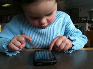
In spite of these challenges, I have been fascinated by one particular case study: my 3-year old daughter, Leah. Ever since a particularly long car trip where we required a means for keeping her entertained, Leah has possessed my old iPhone 3G (sans cell service) loaded with games designed for preschoolers as well as the impossible-to-remove default Apple applications such as maps, weather, and camera.
With the exception of the occasional visit to the Apple Store, Leah does not regularly use a mouse and keyboard interface. This frees her from the years and decades of traditional computer use that form much of our initial interface behavior expectations. Once Leah was exposed to the idea of touching a screen to interact with the application displayed on it, she started tapping and swiping all over the place, often discovering points of interaction that I had no idea existed.
Between her regular iPhone use and occasional borrowing of my iPad (she calls it my “big phone”), I have made a few key observations:
- Touch interfaces can indeed be amazingly intuitive. Stop looking for menus, dropdowns, and “standard” navigation. If something looks like you should be able to touch it, then touch it and see what happens. It’s fascinating to open a new app and watch Leah touch whatever she can find, just to see what it will do. If we can get ourselves past looking for these traditional (and possibly outdated) elements and explore openly like a toddler, I am convinced we will find new joy (and features) using the new generation of devices and apps.
- The enjoyment found using a touch-enabled app is often inversely proportional to how “normal” its interface is. This seems especially true when using apps that rely heavily on the accelerometer to detect motion of the device as a means for interaction. It makes sense to tilt an iPhone or iPad like a steering wheel to steer in a driving game or tip it away from level to cause a ball to roll “downhill” through a maze. These are the same natural physics mechanics that have made the Nintendo Wii a worldwide best-seller. On the other hand, “traditional apps” like word processing programs pretty much still feel like typing out a document.
- Our hands are the most natural interface tool we have. We already use our hands to manipulate keyboards and mice to achieve a desired result displayed on a screen. Why not remove these intermediary devices and interact directly with the content? I have yet to meet someone hesitant to “figure out some new device” who hasn’t fallen in love with touch computing once they have the device in their hands, free from the added complication of a keyboard and mouse. Children discover their world through touch, and that means of discovery translates seamlessly into touch computing.
As application designers and developers, we have a special opportunity to completely redefine how people interact with machines as these touch devices infiltrate the mainstream. It will be interesting to watch these new patterns (or lack thereof?) develop in the coming years. In the meantime, I hope designers and developers will be willing to take some risks and try ideas not possible with our traditional computer usage patterns.
Even more interesting will be watching how my daughter Leah’s expectations of computing will grow differently from mine, seeded from such an early age by these enchanting touch-based devices…